
Dreamweaver Ward
14 years ago
Fri Jun 19 2009, 05:44pm
Dreamweaver Ward
Dreamscape Artist
Wow, that's fantastic! :D I love your Glynna and Ember, and the composition. It's definitely not too monotone - the colours are great!
I like the border, but perhaps it would be better with just the arrows - the musical images are a great idea, but they don't quite seem to fit. Otherwise you could maybe have arrows at the top, and music notes/clefs at the bottom, or the other way around? Or your Unykorn idea could work really well...
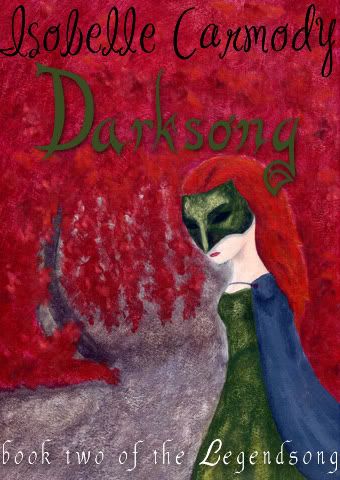
Just one point - it should be book three, not book four.
I can't wait to see how the others turn out - I really hope you get a chance to finish them!
Holy smokes Arien, that's wonderful!!! I like the border images as well, it really sets off the centre image.
Ack, would offer more but have to go pick up Paul from the train station :P
Can't wait to see your other two!!
Ashlings' guildleader
14 years ago
Fri Jun 19 2009, 07:56pm
Ashlings' guildleader
Master of Obernewtyn
Gees Louise! They look great Arien. Definitely like the border, especially the newest one.
WOW!! Those are fantastic!
I definitely like it with a border, but I'm having troubles deciding which border I like more. I think I like the new pattern but I kind of like the colour from the border images in the first one (the lighter brown). I don't know, I just ... like it :P
I love the interweaving hair thing, it's fantastic!
Mystic Ward
14 years ago
Mystic Ward
Twentyfamilies Gypsy
I really like the latest one Arien but I did notice that the whiteness of the veil seems to pull the eye to the left of the cover. It might be more even if it were not quite so...white?
Ashlings' guildleader
14 years ago
Ashlings' guildleader
Dreamscape Artist
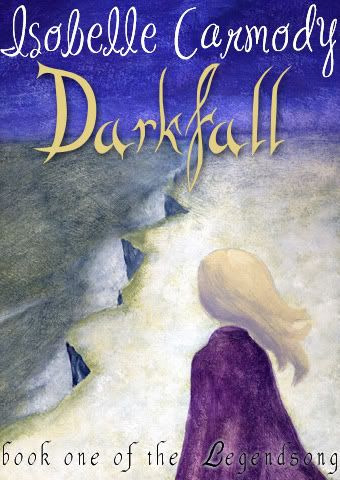
Brilliant Arien! Its absolutely gorgeous! I think I like the first border better, but the second is still really good too. Maybe you could use the second one for this cover and use the first one for Darkfall? The arrow symbol does play a greater role in the first book.
Oh, wow, that's fantastic Zieria! :D
I think the first one is pretty much perfect. But maybe try to make the sea a little more blue, or else have some more wave-like movements? Because at first I wasn't quite sure whether it was sea or desert.
But if that's too hard to do, I think it looks brilliant the way it is. :nod:
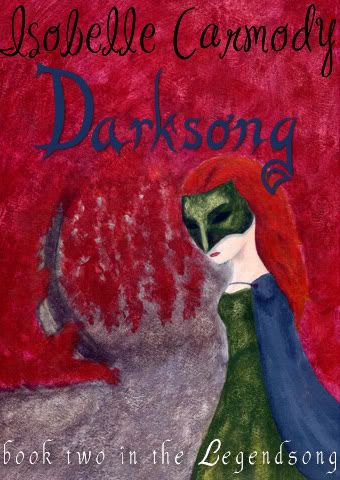
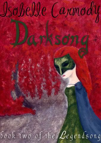
I love Ember in the second one - especially the mask and the dress! The only thing is, I think there needs to be a bit more contrast between her and the background. She sort of blends in with the red. And also, I'm not quite sure what the background is supposed to be?
Maybe it would be better is you darkened the red part, so that there's more contrast.
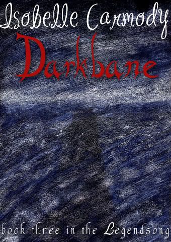
I love the background of Darkbane. I think I get why you've got the shadow there - a looming danger, or something right? I just think that the cover needs more of a focus point, so it would be good to have a person there. Maybe Glynna and Ember together? Or maybe a Unicorn restrained by thorns, or something like that?
Anyway, I think they're all great. :)
Everyone's so talented, I'm so jealous. :| lol ;P
Mystic Ward
14 years ago
Mystic Ward
Twentyfamilies Gypsy
I like them Zier and am envious of everyones work. I actually thought that the first cover had a sky that is too blue. I think it needs something to make it look a little darker but then I'm not an artist.
Ashlings' guildleader
14 years ago
Ashlings' guildleader
Dreamscape Artist
They're beautifull Zier, I love them!
I mostly agree with avialle on the areas that could use improvement. I think maybe if you gave Darksong's background a little more texture it would help, I think its meant to be the fire behind Ember when she's singing right? Assuming that I'm right, I like that she blends in with the fire because that's what she does in the scene, but more texture might help to show that.
With Darkbane, I think that maybe if you just gave the shadow a little more definition it might make it a little more obvious that it's a shadow and help give the cover some focus.
I also agree with avialle on the talent envy, I wish I could draw like that. [act]pouts[/act]
14 years ago
Mon Jun 22 2009, 08:54pm
Awesome Zier! They're great ;D I agree about the background of Darksong...I think maybe it could use a little more texture or colour definition. Your Darkfall and Darkbane covers are quite textured, and the red background looks a bit flat in comparison. The blue 'Darksong' clashes a bit for me too. Maybe if the lettering had a little more shadow? But yeah overall they're looking really good, and I think the three match together well. :nod:
And thanks for all the feedback on mine guys, it's been really helpful :)
14 years ago
Tue Jun 23 2009, 07:45am
OH wow, Zier! They're beautiful!
I agree with what everyone else has said - the sky could be purpler in Darkfall? It's beautiful as it is (I think it's my favourite of your three :) ), but just test hueing the colours a bit and see what result you get.
Darksong looks gorgeous, but I agree the Red background is overwhelming Ember's hair a little. The Mask texture and depth is amazing by the way!
The lettering for Darksong - sorry, the colour of it - doesn't quite match the others? Fall/Bane use contrasting colours, and I wonder what the Darksong title would look like if it were perhaps, a lighter green?
Darkbane looks so mysterious, I love the effect! The shadow possibly a little more pronounced, is about the only thing I could think of altering? But it's fine the way it is, too, in that it makes you keep looking at it :D
Arien - i LOVE the new border! The effect of your cover is just...amazing. About the only last thing I can think of - and it's fine as it is honestly! - but I wonder what the title text would look like in a lighter colour - so it hits you in the face a little more (but obviously not too much). The first thing I look at is the image, the author (it sits out of the page a lot more), and then I notice - "Darkbane".
WOW!! They're beautiful Zie!!
Darkfall's my favourite, it's so pretty! I would read that book. Love the colour of the vertical parts of the cliff, it gives it real depth.
I agree with the others that Ember's hair is being lost a little in Darksong. I love her mask and dress, the colour is fantastic. I'm a little confused about what the curved thing is though :-?
I don't really get what Darkbane is showing, but I like that. Gives it mystery! I agree that a different colour for the word 'Darkbane' could work better, but I don't mind the red.
Once again - wow!! They're so pretty!
Mystic Ward
14 years ago
Mystic Ward
Twentyfamilies Gypsy
I like the adjustments Zier, and I like option number one for the Darksong cover.
I like the first option for the font colour in Darksong.
I'm not really sure what's changed in Darkfall, but I still like it!
I doubt even if I'd just read the book I was going to recognise a picture of the healing centre on Vespi - what can I say, I skim descriptions :P My one problem with the Darksong background is the curved bit, it really reminds me of a satellite dish on its side or something - sorry! If it was a little bit less curved, or maybe if a bit more of the arch was visible higher up, just another glance or two somewhere that I could guess it connected to, I'd be able to tell what it is more. Now that you tell me I can see the red is on top of the black, but before it looked like the red was just a background colour and the black was an object. Maybe even if there were a few holes in the red, gaps in the creeper, it would be more obvious it was a thing and not a backgroun colour.
Sorry if that's really hard to do!
Mystic Ward
14 years ago
Mystic Ward
Twentyfamilies Gypsy
I like Arien. That looks really good.
Ah wow, Arien! Those covers are spectacular!
14 years ago
Sun Jun 28 2009, 10:34am
Arien: I love it! I love the music along the bottom, it's great and really works for the scene given that the Song pulls her through. I prefer the neater version too. I'm not really sure what's in the corners, but I like it. Absolutely fantastic!!
EDIT: Susie put hers up while I was typing! They're really good Susie! I love the theme of the hair and how they all sort of tie in together with the banner across the middle. The only thing I could think to change would be to move the ocean down so that waves go all the way to the bottom of the darkfall cover. It's just that that one has a block of colour whereas the others still have a picture there. But it's not a big thing, it looks great still the way it is. Love your picture of coastline for Darkbane.
This is going to be so hard for Isobelle to chose, everyone's entries are fantastic!!


